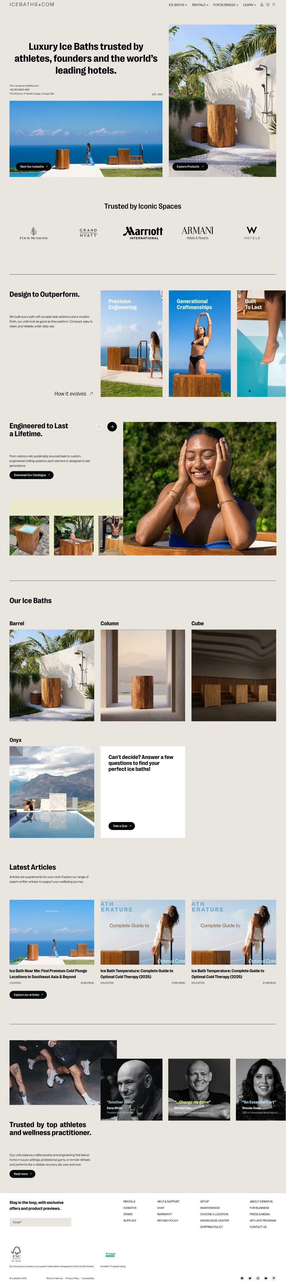
Rebuilding a Broken Store Into a Cold-Plunge Brand
Design, engineering, and art direction for a premium handcrafted teak cold therapy brand from Bali.
Discipline
UX/UI / WordPress
Project
Case Study /01
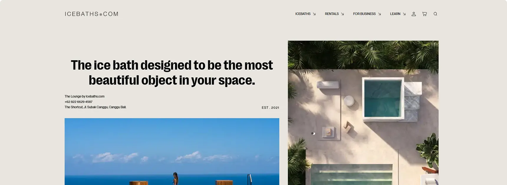
Executive Summary
I rebuilt icebaths.com top to bottom. I took over a half-finished Shopify store that Google hadn't indexed, with no acquisition strategy behind it. I moved the brand across three platforms, designed every page in Figma, art-directed the lifestyle and product shoots, and built out the marketing.
In the first four months it pulled 54.8k impressions, 1,210 clicks, and 139 qualified leads, an 11.5% click-to-lead rate.
The Starting Point
What I inherited
The product itself was genuinely premium. Handcrafted teak cold plunges, built in Bali. The digital side didn't come close. The Shopify store was half-finished, visually broken, and not indexed by Google, so search couldn't find it at all. There was no funnel, nothing capturing leads, and no real acquisition plan. On the growth side, the brand was sitting at zero.
Unfinished Shopify build, visually inconsistent.
Invisible to search, no organic discovery.
No funnel, no lead capture, no acquisition.
The Approach
Rebuilding instead of patching
Rather than patch a broken store, I migrated the brand in stages. I got it live and selling fast first, then moved to a stack we fully owned, a WordPress build with Gutenberg for editorial control and lead capture wired into Klaviyo.
- From
Broken Shopify
Unfinished, not indexed.
- Step 1
Instant + Figma
Figma-driven build on Shopify Enterprise, quick to launch.
- Step 2
Bricks Builder
More design control as the brand matured.
- Now
WordPress · Gutenberg
Fully owned, editable, performance-tuned.
Designing and art-directing the brand world
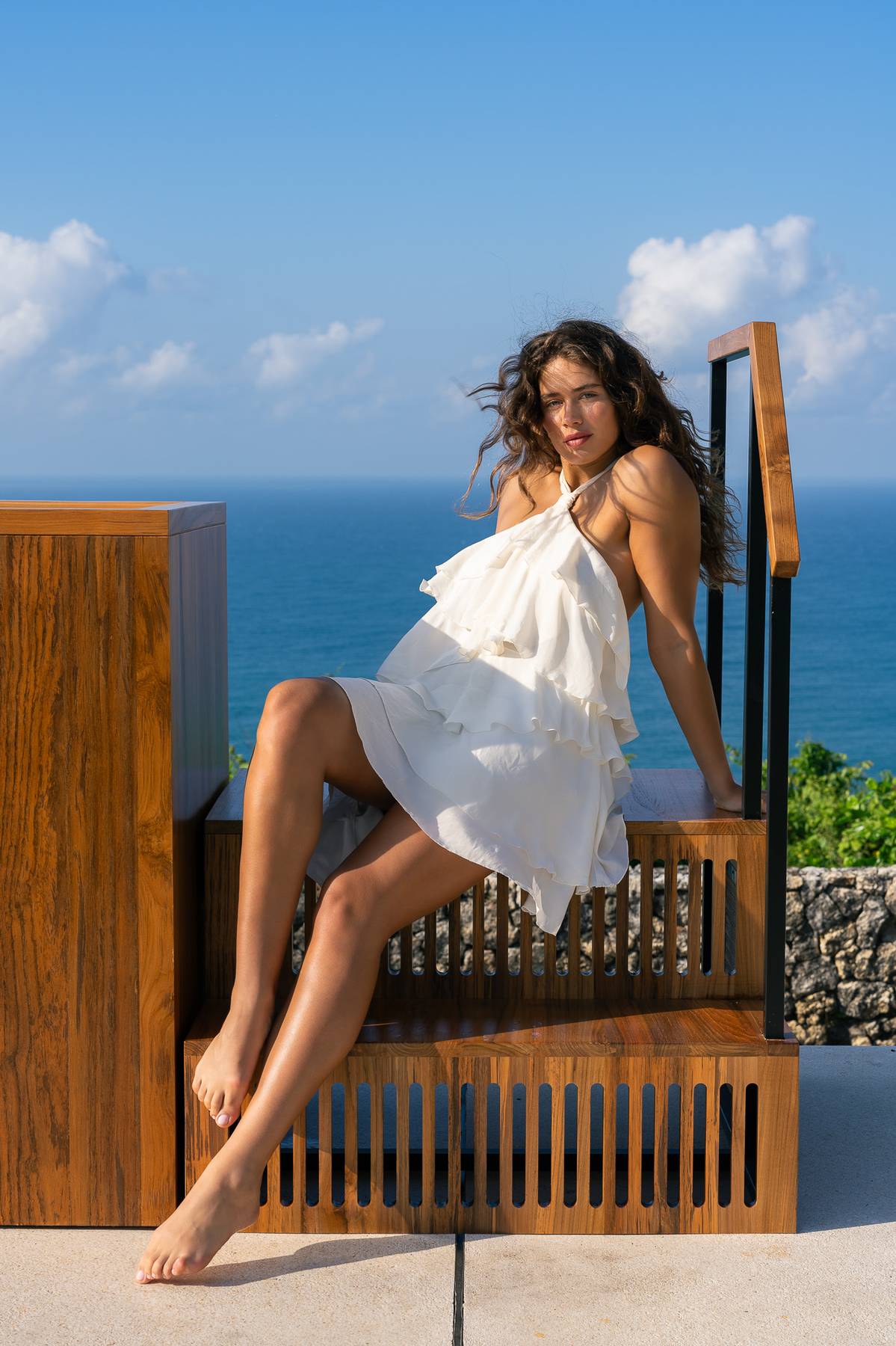
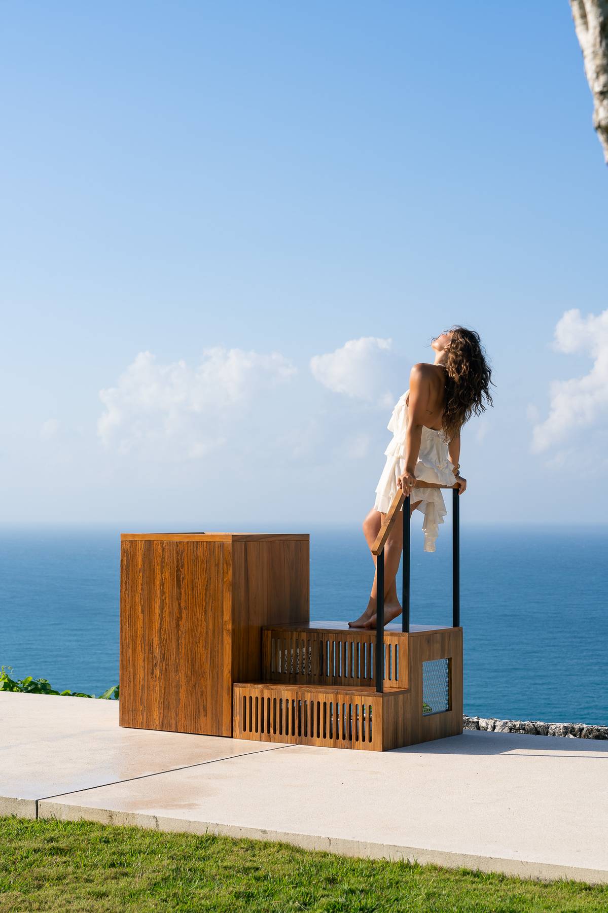
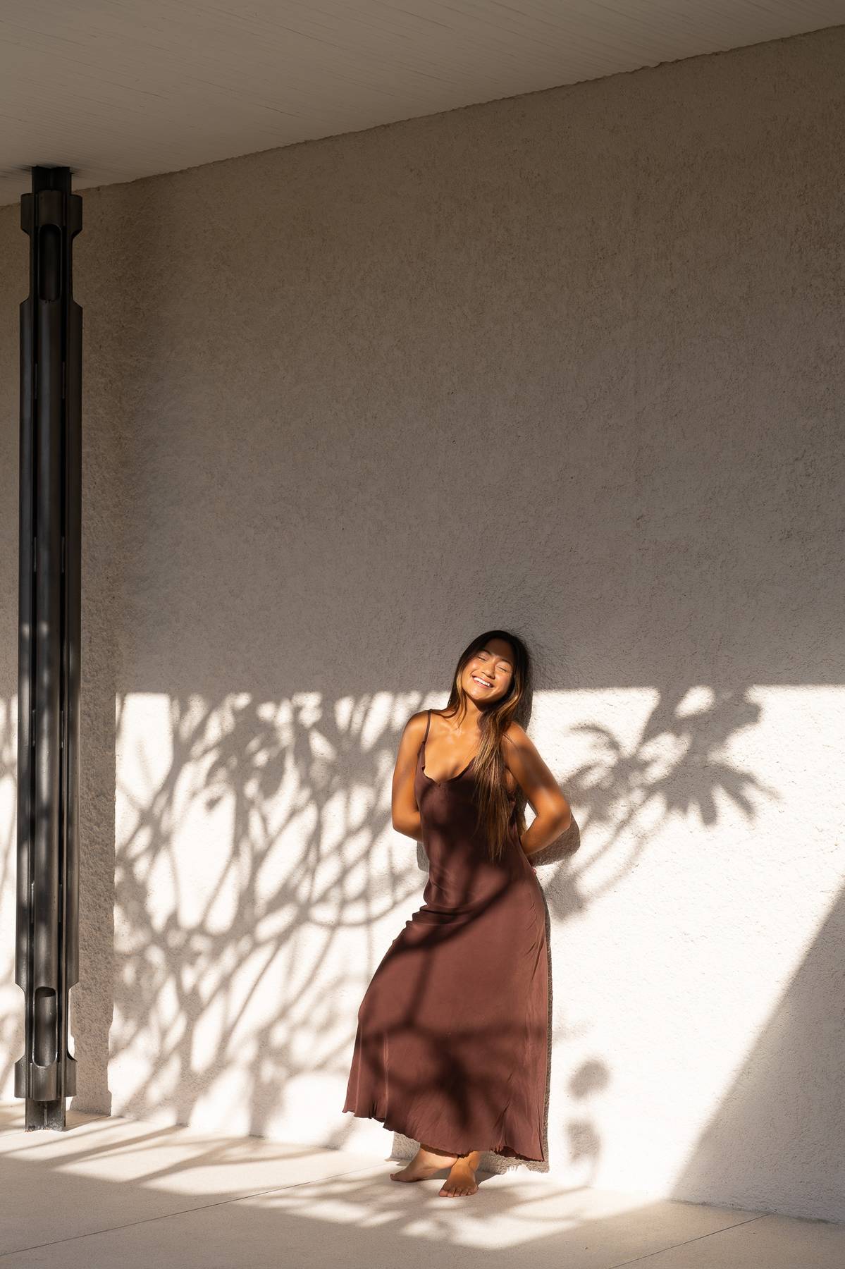
I designed every page in Figma first, a component system covering the homepage, B2B solutions, and the product pages for the Barrel, Column, Cube, and Onyx. Design alone wasn't going to do it, though. A teak cold plunge doesn't read as luxury unless the photography sells it, so I produced and art-directed the lifestyle photo and video shoots, running the creative team on set, stylists, photographers, videographers, and HMUA.
Building the growth engine
The first job was getting the site indexed so it could actually show up in search. From there I built the acquisition side: SEO, Klaviyo lead capture and email flows, and a B2B inquiry path for gyms, spas, hotels, and residences. The engineering held up under all of it too, so the site stays fast and steady as the catalogue grows.
Engineering
The site is fast, the menus move well, and the cart behaves. The work I'm prouder of is underneath all that. I built it so a small team can run the whole brand day to day without a developer on call.
One codebase the team can actually own
I wrote the theme object-oriented. Namespaced classes with PSR-4 autoloading, each one handling a single job: setup, assets, the block editor, post types, the menu. No 2,000-line functions.php to wade through.
On top of that I built 21 custom Gutenberg blocks for the content the brand actually uses: heroes, product features, FAQ, case-study grids. Every field definition is committed to the repo as JSON, so the build is reproducible and nothing important lives only in a database you can't version-control. For the brand, that means a non-technical editor can change any page in Gutenberg while the markup itself stays under engineering control.
Most of those blocks are configuration-driven, which is fine when you're optimising for editorial speed. Where I needed full control over the output, I hand-built native blocks and shipped them as their own plugins. The clearest example is the tabbed product content: a two-block setup where the container only accepts tab children, rendered entirely on the server. It re-parses its own inner content and rebuilds it into clean, semantic markup, so editors author tabs the obvious way and the front end still gets the exact structure it needs. A lot of the job is just knowing which of the two to reach for.
Rendered on the server, enhanced in the browser
I had one rule for the front end. Render the structure on the server, then layer behaviour on top as lightly as I could. No single-page app, no framework weight for what is, mostly, a content site.
The navigation is the clearest example. A custom menu walker builds the markup on the server, then a thin Alpine.js layer turns it into two different things. On mobile it's a sliding menu, a small state machine that tracks which panel you're on and where you came from, so moving between levels feels closer to a native app than a page reload. On desktop it's a hover-intent mega menu with a small delay so it never flickers, fully keyboard- and screen-reader-accessible: Escape to close, focus properly managed.
Commerce works the same way. The product and cart quantity controls are custom-built, but under the hood they dispatch the exact events WooCommerce expects, so nothing fights the platform. The cart update is debounced too, so changing a quantity fires one update instead of one per tap.
Built to stay fast, and to hold up
Speed isn't something I added at the end; it's part of how the site loads. Scripts are deferred to the footer, third-party origins are preconnected before the browser asks for them, and assets cache-bust automatically when they change. The site ships with a cumulative layout shift of zero, so nothing jumps or reflows while a page loads, even as the catalogue grows.
Quality is held up by tooling rather than by me remembering to check. The codebase runs against WordPress coding standards and static analysis, and I wrote the project's own rules into that setup so problems get flagged while I type, not weeks later in review. A year from now it should still be fast and still be pleasant to work in.
Art Direction
Directing the campaign that made the brand feel premium
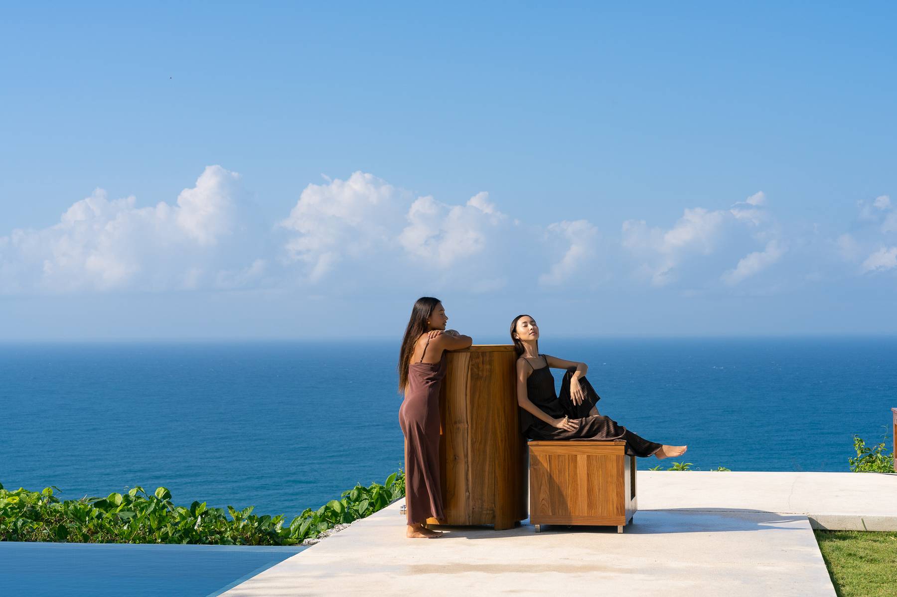
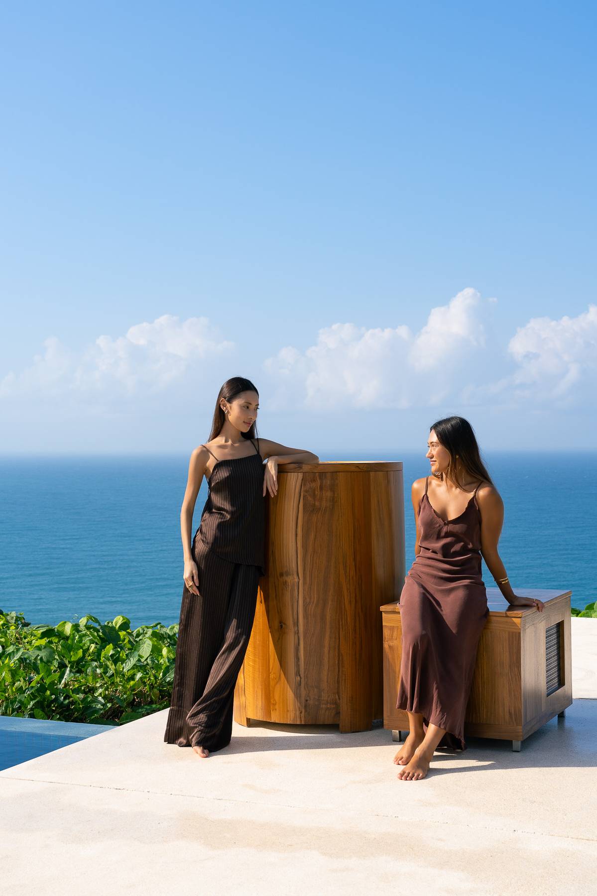
With a product like this, the imagery carries almost all of the appeal. So I produced and art-directed a full lifestyle photo and video campaign for icebaths.com, wrote the concept, built the shot list, and directed the crew at a location in Bali.
Pulse
The idea behind the shoot: life moves fast enough that you forget you're alive, and the cold plunge is the jolt that snaps you back into the moment.
I built the whole campaign as one arc, from the quiet of early morning, through the heat of a workout, to the shock and clarity of the plunge. The point was for every frame to push toward a single feeling instead of landing like a stack of unrelated product shots.
- 01
Gratitude
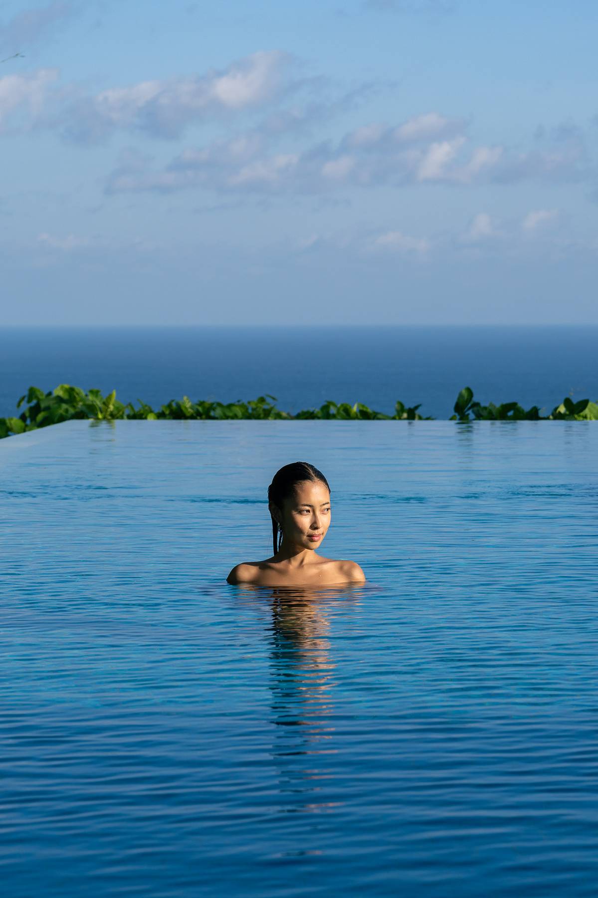
Dreamy, calm establishing shots before the rush. Landscape, architecture, the location waking up.
- 02
Arrivals
Early-morning movement. Breezy, flowing Pilates and yoga, the bath always somewhere in frame.
- 03
Setting an intention
Intimate and loose, warming up. Leaning against the bath, waiting, easing into the day.
- 04
Finding fire
Intensity. Flushed cheeks, sweat, quick cuts. Fully in it, the bath waiting in the background.
- 05
Committing — the plunge
The hero beat. The breath before you commit: hesitation, then resolve, then relief. The product's whole reason for being.
- 06
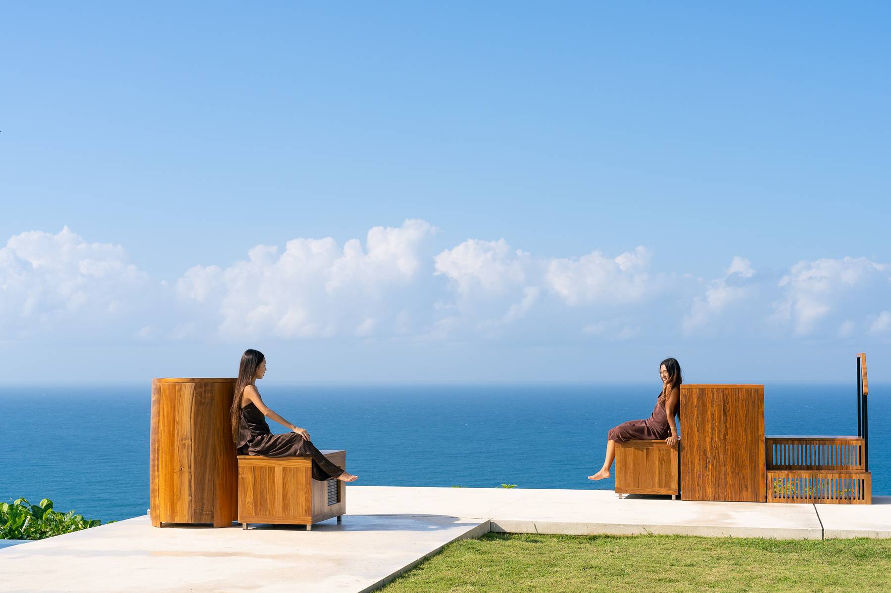
Mastery
A wide, centered exhale after the cold. Symmetry, open horizons, a clear head.
- 07
Product moments
Tight, tactile detail: toe to water, hands on the teak edge, grain and shadow. The craftsmanship up close.
I direct 3D renders the same way I direct a shoot
A film crew and a 3D pipeline aren't that different to run. You set the concept, decide the mood and framing, then push the people or the tools through each shot until it matches what you pictured. I produce the brand's 3D product imagery the same way, scripting the camera moves, lighting, materials, and hero angles so the renders feel like a lit set, every camera move and material chosen on purpose.
The Outcome
From zero to a working funnel
Four months after launch, a brand search couldn't even see was bringing in real, trackable leads, at a click-to-lead rate that beats the usual e-commerce benchmarks for high-ticket products.
Reflection
One person, the whole stack
This one needed range. I wrote the code, designed it in Figma, directed the shoot, and built the marketing that turned visitors into leads, the kind of spread most brands hire three or four people for. The cold-plunge market is full of mass-produced acrylic units; my job was to make a handcrafted Bali brand look and sell like the premium product it actually is.